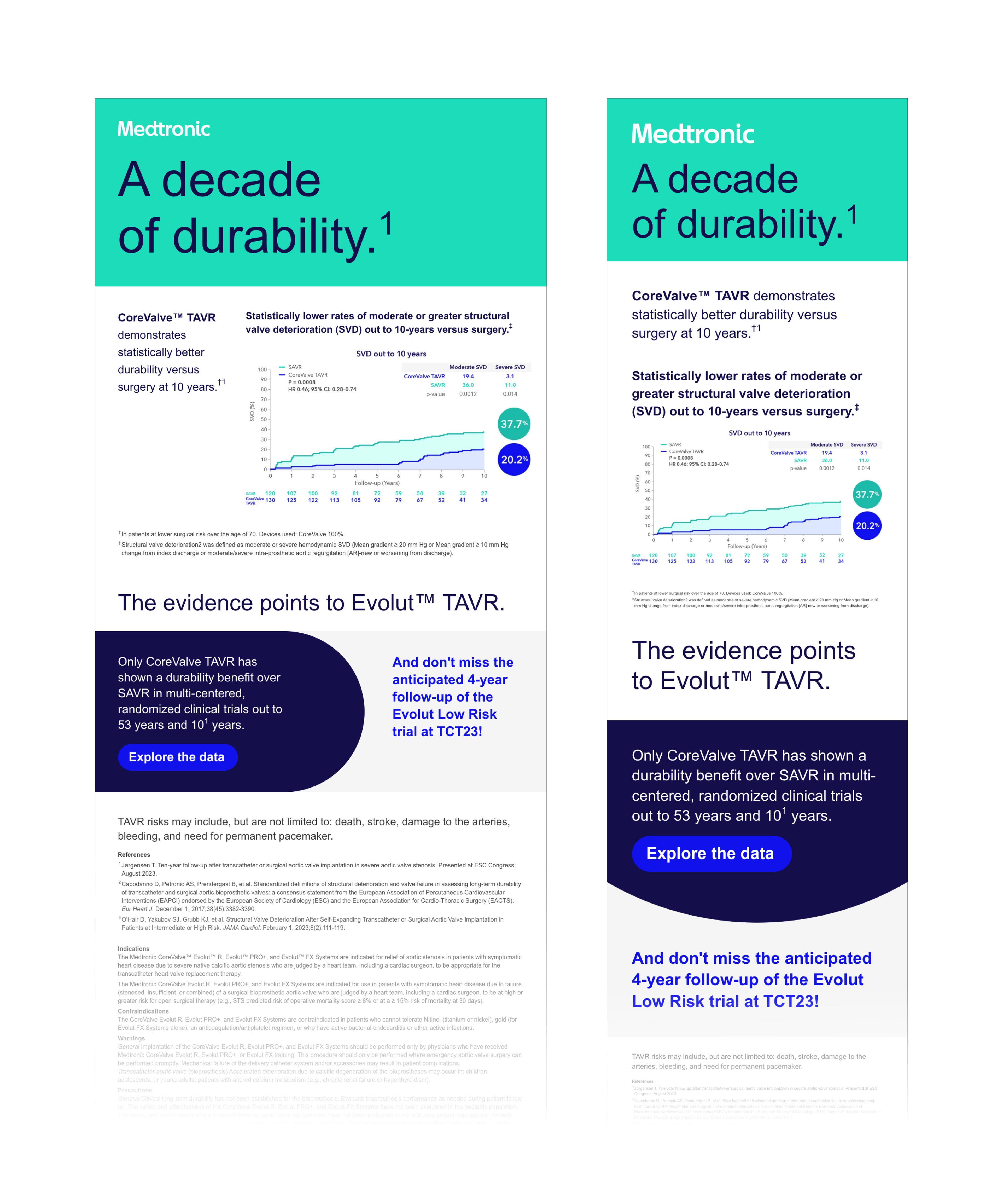
One question I ask as I start every project is, how can I break this content up in a more digestible way? I often begin with a content document with large chunks of text accompanied by a complex dataset. This project is a prime example of how I was able to dissect an email into shorter sections, keeping the viewer engaged with quick sentences and snappy colors. In addition to the design aspects, I was able to use CSS classes to change an image from desktop to mobile. This simple swap acts as an indication to continue on in each viewport, whether going from left to right in desktop, or to keep scrolling on mobile.